 Mobile App CMS
 Web CMS
 Blog
Blog
 For IT
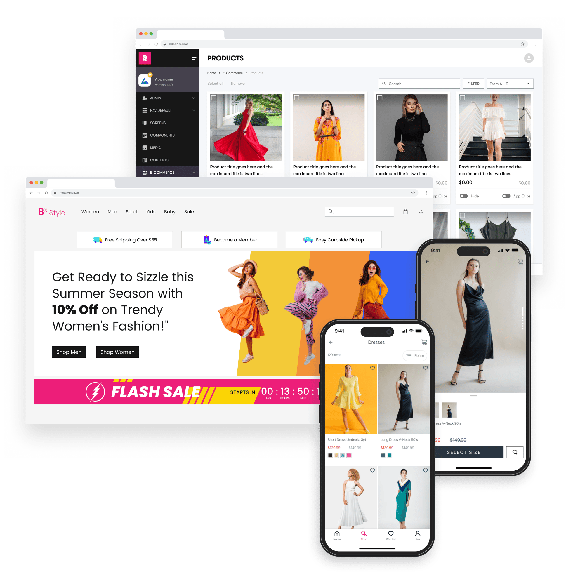
BILDIT CMS for e-commerce and retail
Generic Content is Killing Your Conversion
92% of First-Time Visitors DO NOT Make a Purchase and May Never Return. Personalize content for your customers across channels.

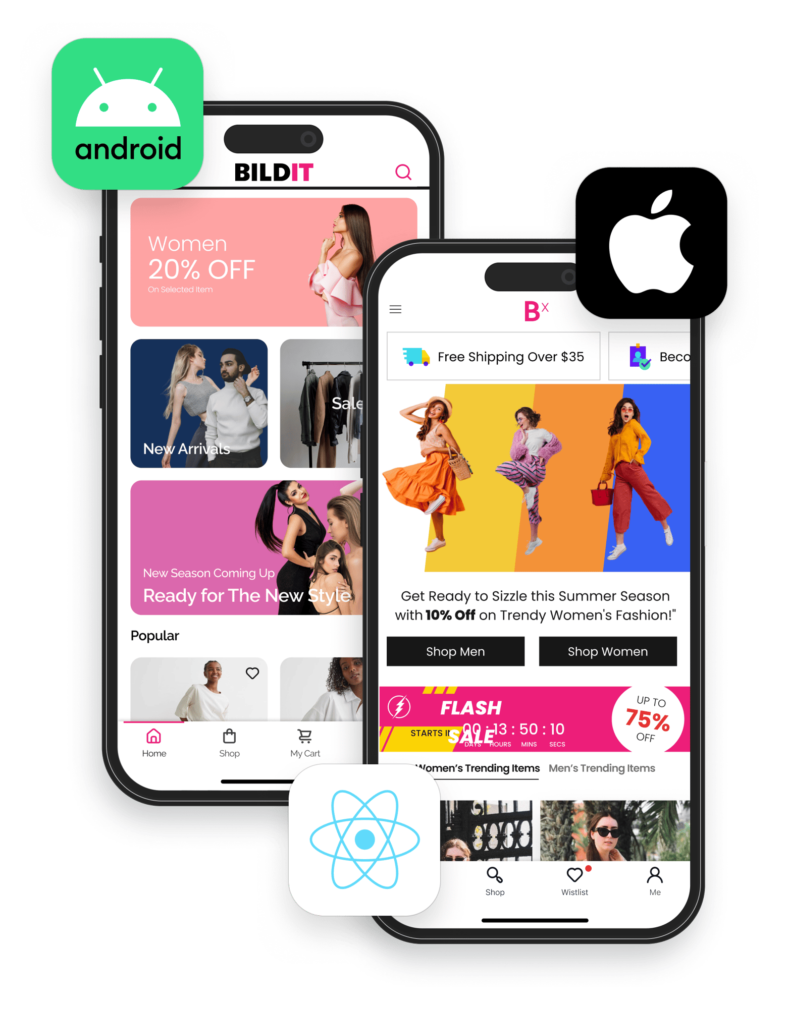
Web
Mobile app
Email
Push notifications

BILDIT CMS PLATFORM OVERVIEW
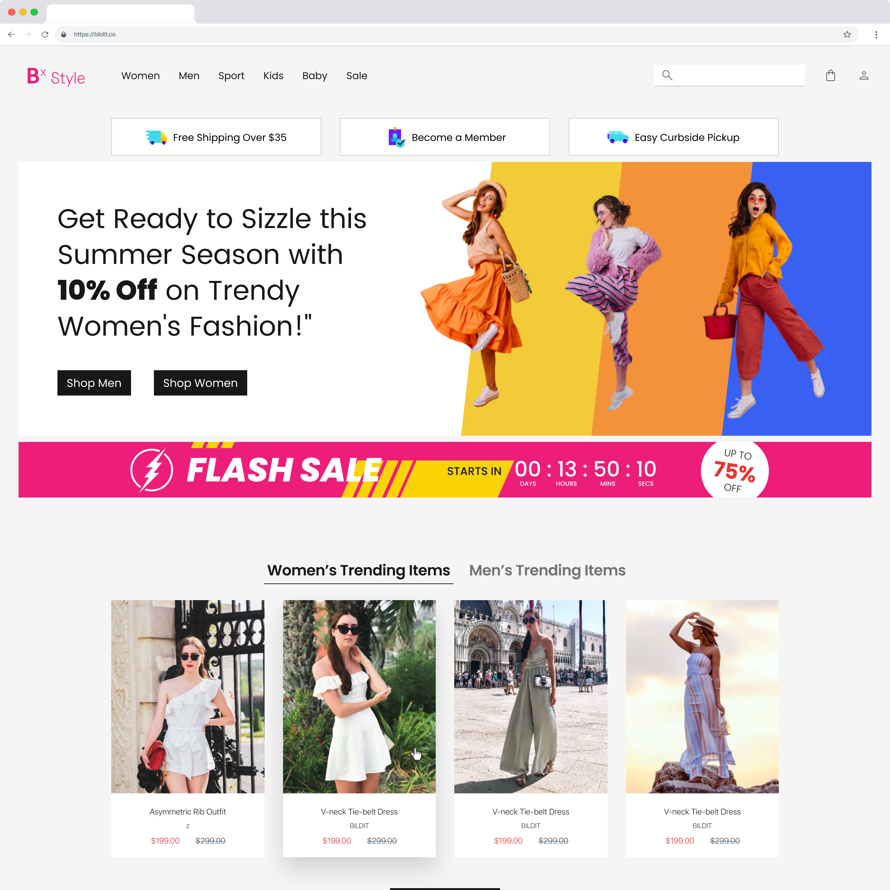
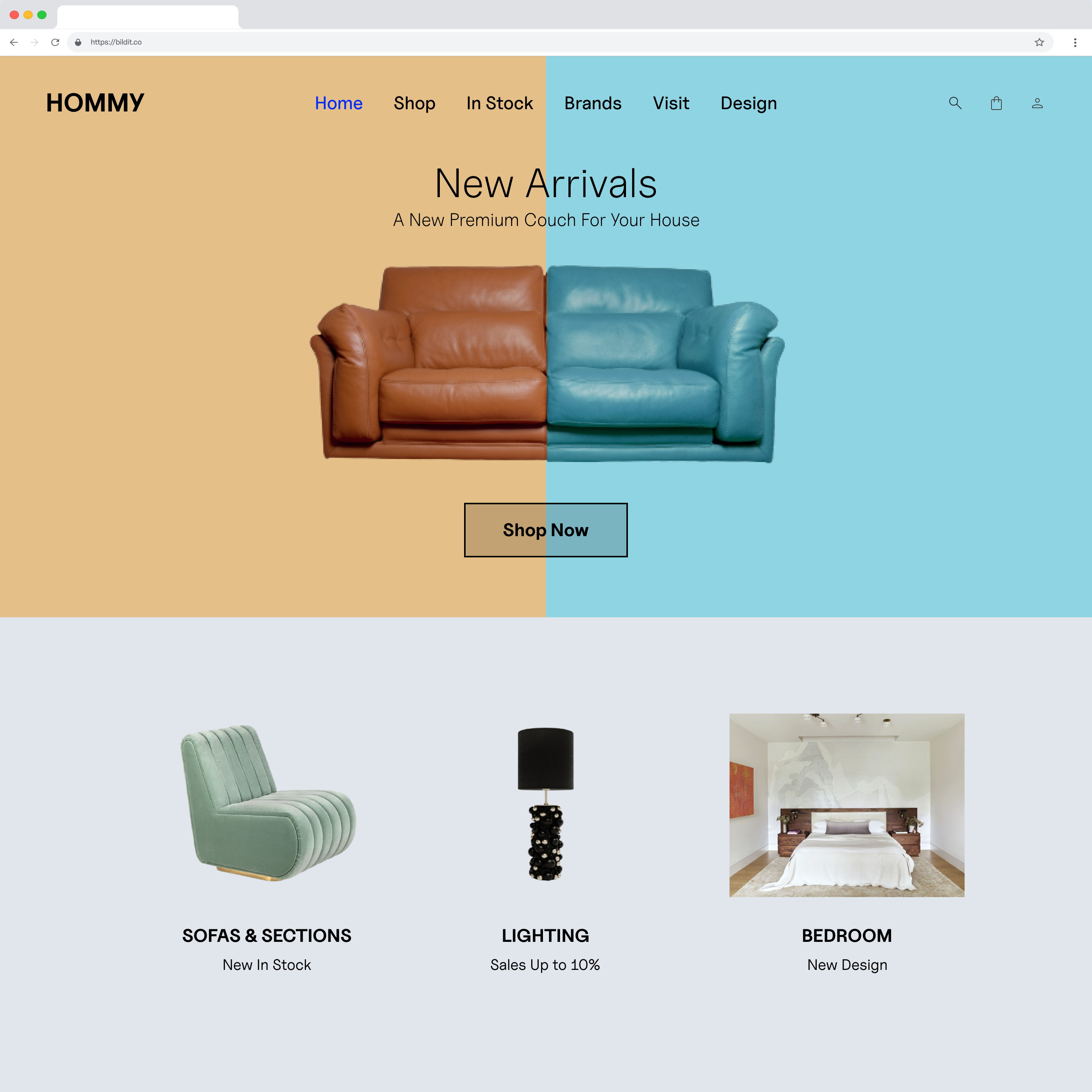
Launch more, launch faster
Line up your next campaigns in hours, not weeks, with the e-commerce CMS platform that helps marketing teams create unified cross-channel content experiences
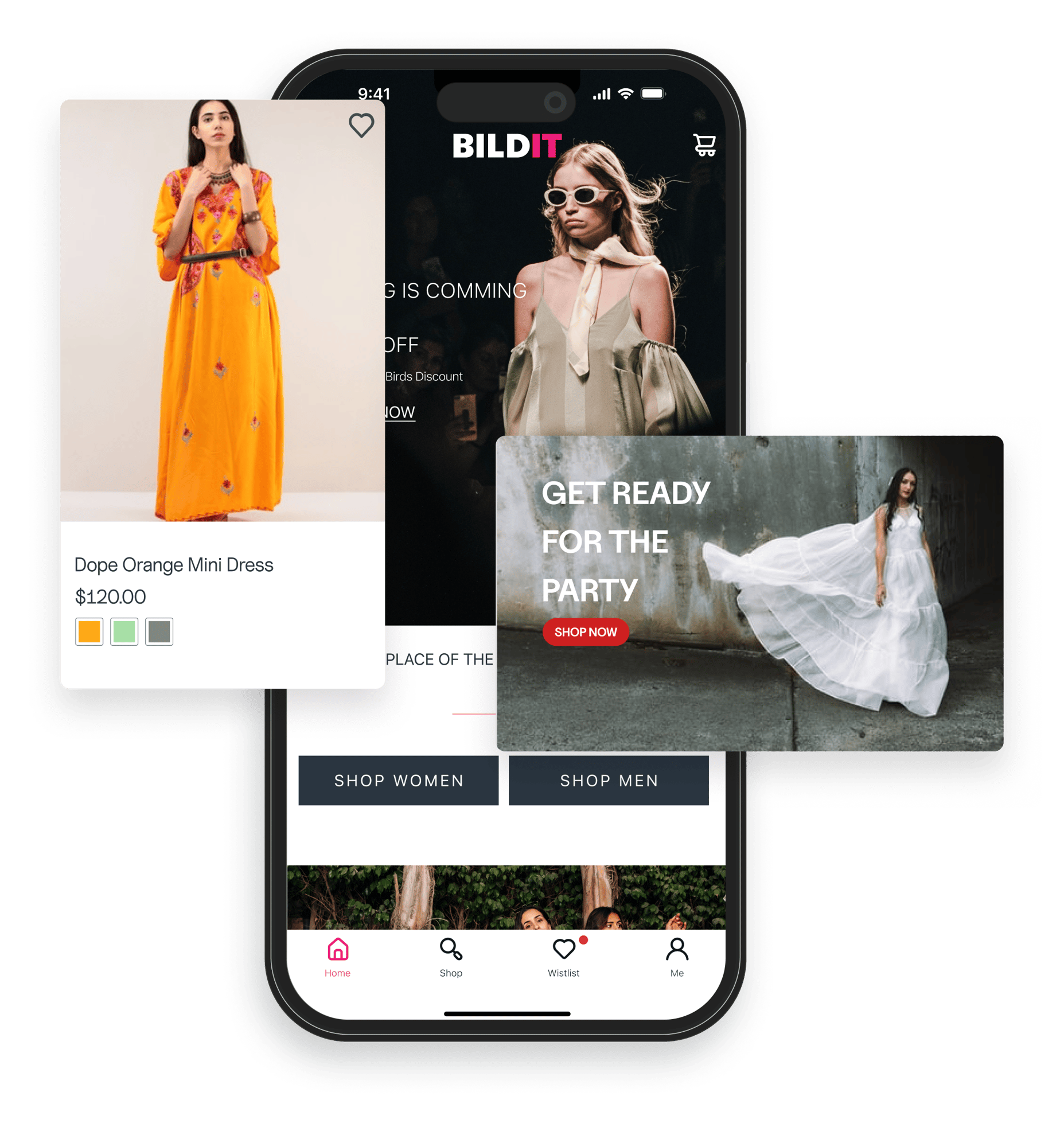
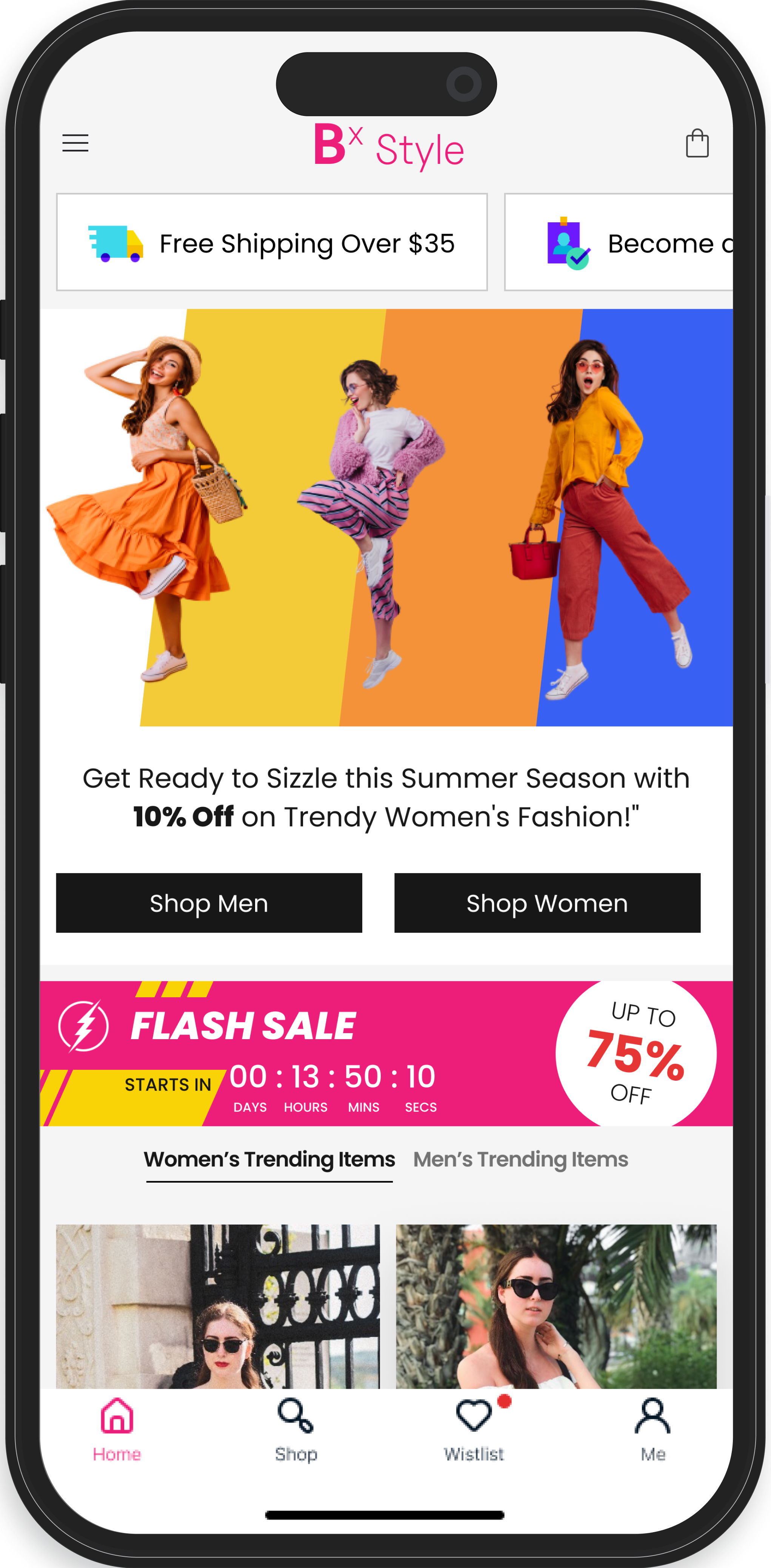
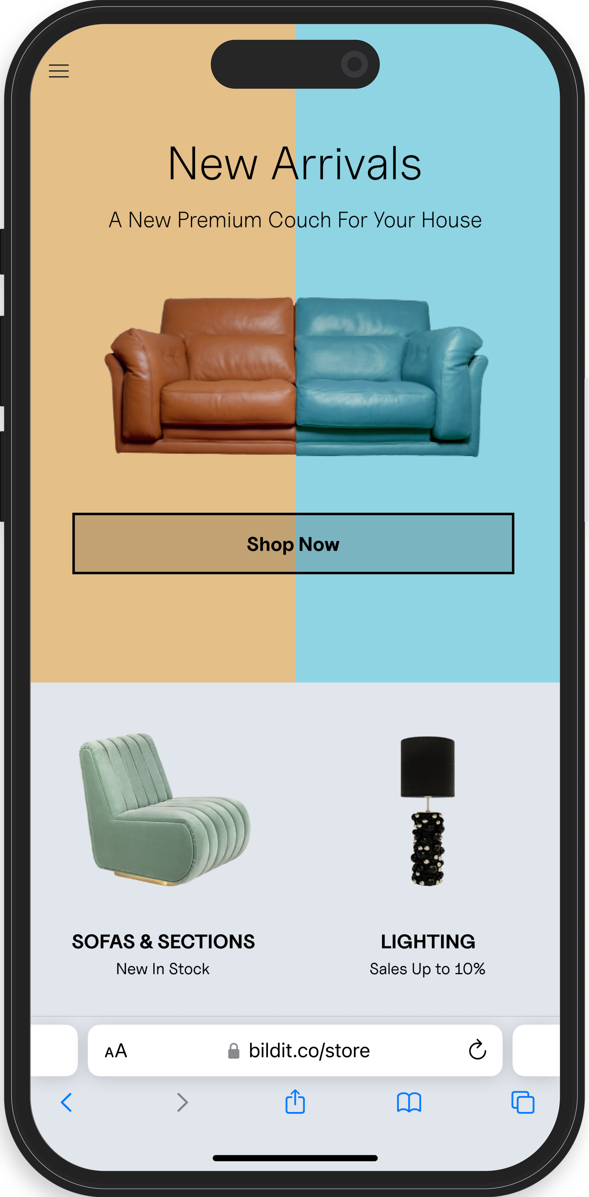
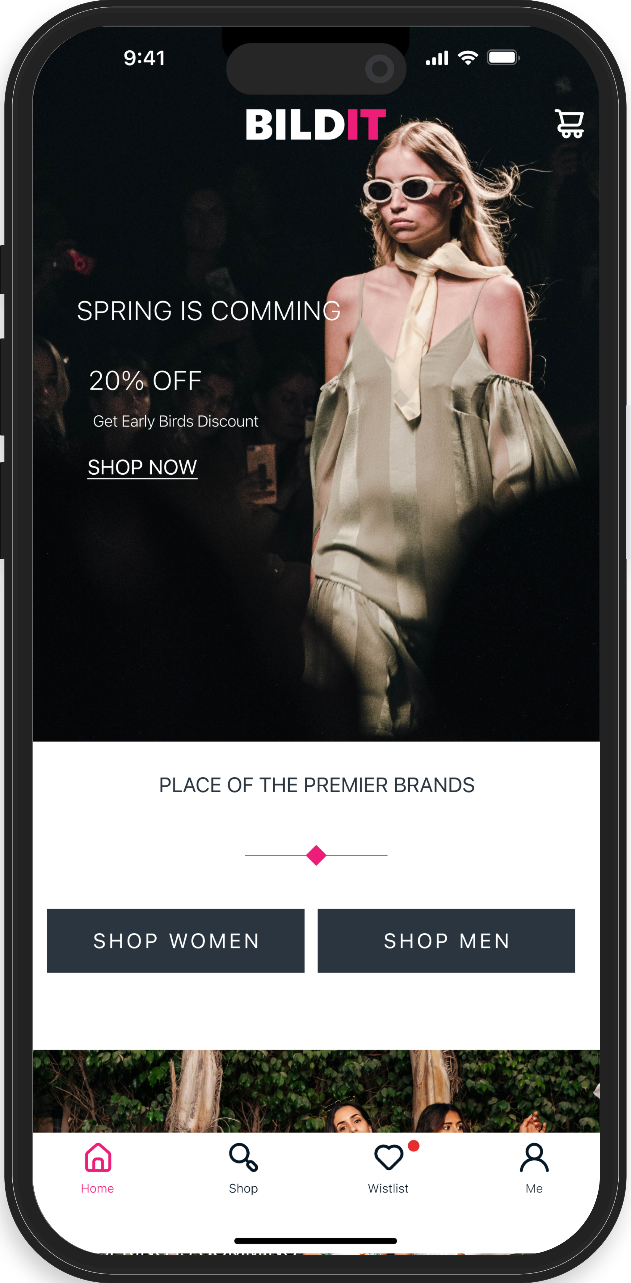
Easy cross-channel content management
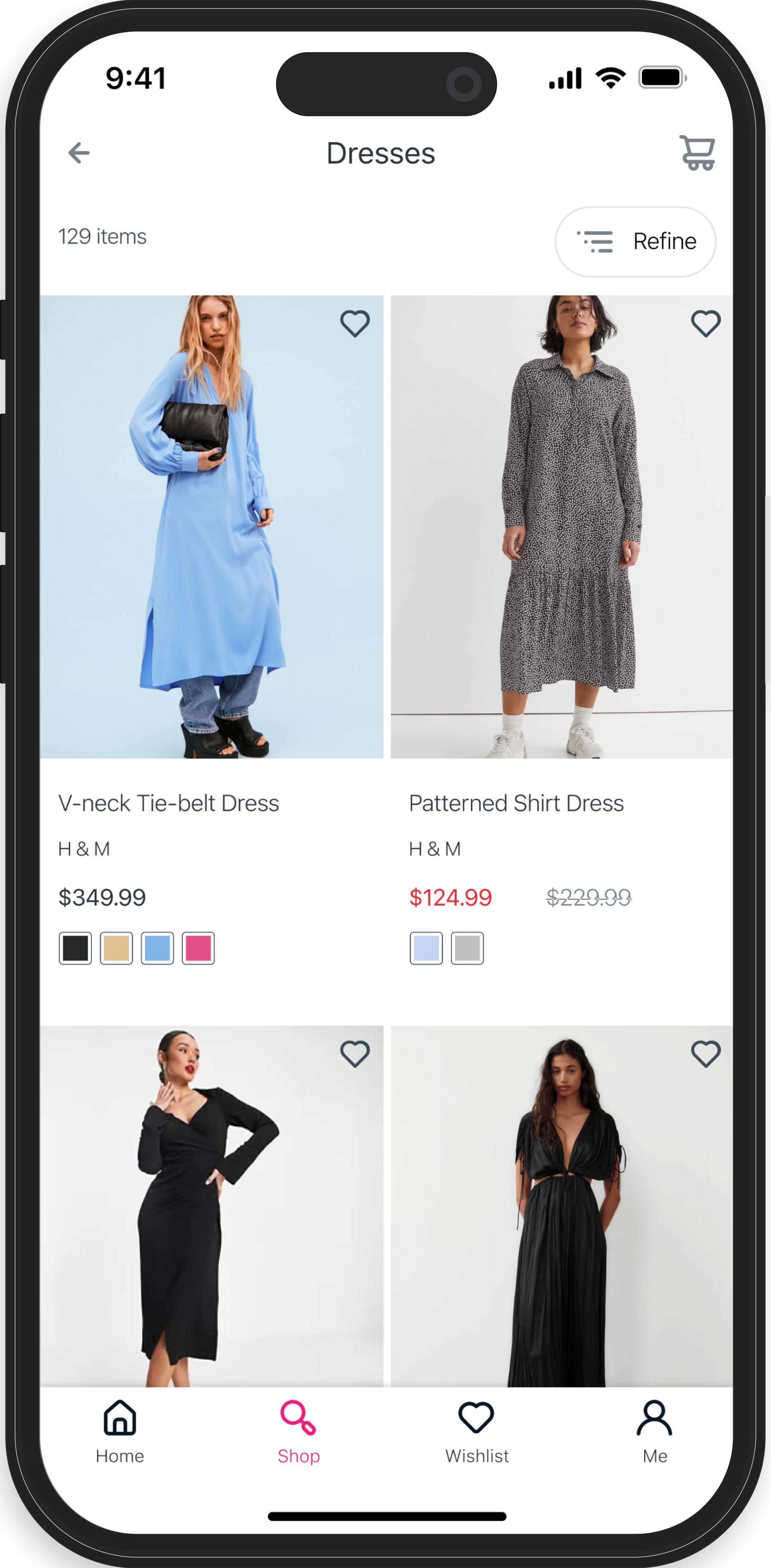
Schedule and preview content even with Server Side Rendering or Mobile App
Preview on mobile app advanced React Native content like Instagram style stories, video players, or carousels
EASY CROSS-CHANNEL CONTENT MANAGEMENT
Manage content for web and mobile. In a single e-commerce CMS.
Create, edit and deliver your sophisticated content. Schedule content. Real-time preview and preview links sharing (even on mobile app).
Store, edit and publish content across channels from a single CMS
Rapidly update your published content with multi-user access and modular editing
Streamline approval and deployment right inside the CMS
COMPLETE CONTROL OVER CROSS-CHANNEL CAMPAIGNS
Launch the way you want. Without waiting on developers.
Build, schedule, launch and update revenue-driving campaigns across multiple channels.
Rapidly launch on-brand, consistent campaigns with code-as-content snippets
Manage multiple campaigns and schedule them in advance for seamless rollout
Build sophisticated cross-channel campaigns and optimize them no-deployment-required testing.
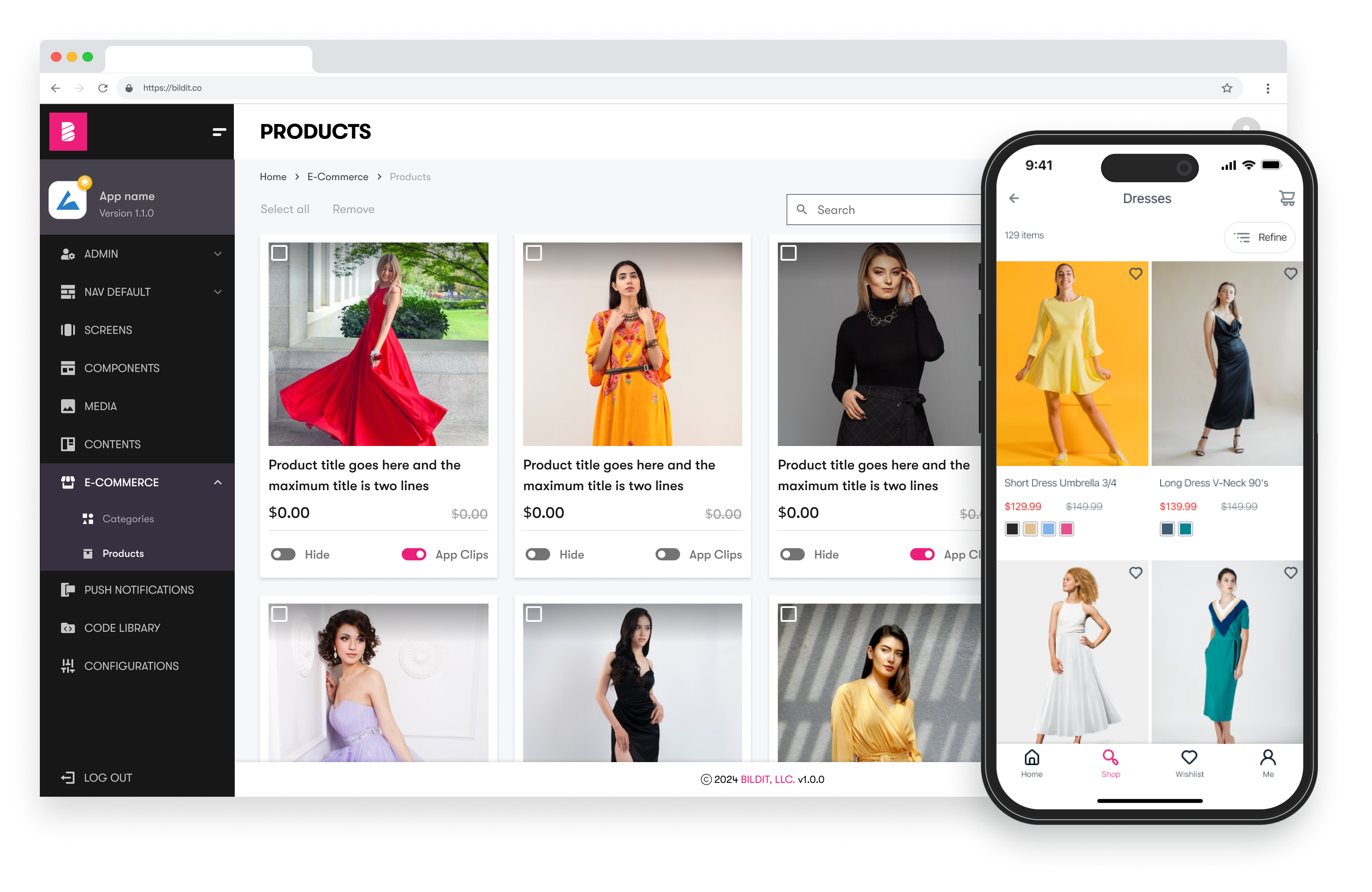
ADVANCED MOBILE APP CAPABILITIES
More control over your mobile app, or Next.js site.
More conversions with personalization.
More conversions with personalization.
Build out advanced content types, from videos to filtered product displays. Deliver right content to right users at the right time with personalization and advanced targeting.
Create unique experiences by managing product and category display on web and mobile
Add custom links to display banners on specific product or search result pages
Set up conditional product display with e-commerce platform integrations
Sophisticated content
for web and mobile, effortlessly
for web and mobile, effortlessly
One CMS platform. Endless possibilities to create stunning images, banners, recommendations, animations and customized display configurations.


